“Happiness doesn’t always come in pink. Learn to appreciate the rainbow.” – Richelle E. Goodrich
Colour matching is all around us! When you are awestruck by a mesmeric sunset, you are actually seeing a seamlessly flawless blend of yellow, orange, and red. Similarly, the breathtaking northern lights won’t have the same impact if it wasn’t for the brilliantly luminous yellow, green, and playful hints of red and blue.
Likewise, colour matching can do wonders to your home décor, making everything come together – from the overall theme and furnishing to the general ambiance. However, it is imperative to choose colours that work well together – nobody wants their house to look like Ronald McDonalds’ personal playground.
Don’t worry – we are here with some excellent home interior tips that will help you in making all the right decisions for your house, and enjoy it in full capacity. Here are some important things to keep in mind when colour matching for home interiors.
The Colour Wheel is Your Best Friend
Let’s go back to the basics – red, yellow, and blue!
We all know that every other colour is made by mixing the three primary colours. So in order to decide which colours are working well together, using a colour wheel is a safe method for sure shot success. Colour wheel visually represents the relationship primary colours have with each other. It also gives an insight of the blend of secondary and tertiary colours.

On the colour wheel, colours opposite to each other work together in a perfect balance to create a beautifully radiant layout. For instance, red and green are opposite to each other on the colour wheel but make your Christmases extra merry when used together.
Work in Odd Numbers
The rule of 3 is a simple and easy-to-follow rule that works wonders in home décor. When applied on colours, it simply suggests selecting a theme with 3 colours, and working with them alone.

This works perfectly with the 60-30-10 rule, where 60% is the primary or main colour, 30% is the secondary colour, and 10% is the accent or complementary colour. Most colour combinations work superbly when applying the rule of three.
Flow and Balance
Once you’ve committed to a colour palette, it’s all uphill from there!
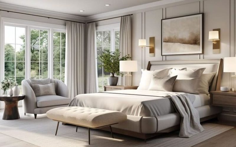
Don’t add more colours; rather apply the same colour theme with colour matching. This doesn’t mean that each room should have identical colour themes, but rather a coordinated and classy. For example, earthy tones are a popular colour trend for 2022. Green instantly comes to mind, and a grey green colour matching with accents of gold or brown blend together in a perfect harmony.
The entire house doesn’t have to be monotonous with the same green, rather shades of sage, emerald, and light hues can be incorporated in the kitchen cabinetry, lounge chair, or fabrics and linens. It makes each room distinct but also creates a flow and balance so that they all still look like a part of the same house.
A Song of Ice and Fire
Disclaimer: No dragons were harmed while stealing this title from George R.R Martin.
How does this title come into play for home décor? Well, each colour has a temperature per se. You have cool colours like greens, blues, violets, and warm colours like reds, yellows, and oranges.

When choosing a colour for your home, a balance should be created between both warm and cool tones for flawless matching. Colour mixing of cool and warm colours creates a space that’s fresh, comfortable, and easy to live in.
An example of this is taking blue as the primary colour, with accents of scarlet or yellow to add a pop of colour and balance it out.
This part does take a little practice to get right – and following so many rules can frankly get too overwhelming.
If you need a helping hand with picking colours for your home or matching colours with existing décor, we’ve got you! We offer colour consult via the 1-hour design consult package. In an hour, we would help you on your way to being a pro at picking out the best colours to transform your home!
Choose from a variety of our Mondän packages and start your journey with us.


No Comments